Introduction
- HTML: Structure of web pages; moreover
- HTML elements have a default presentation
- Some elements and attributes are used for presentation (physical formatting)
<em><font size=10 color=red> test </font></em>- Tremendous repeated formatting tags
Introduction (Contd.)
- (in HTML) Separation between
- Content & Structure
- Presentation
- Content & Structure are specified by HTML tags
- Cascading Style Sheet (CSS) defines the presentation and style of web pages
- How elements are presented in web pages!!
- Override the default presentation of elements
- CSS is optional, if presentation is not specified, browser uses its own default presentation for HTML elements
Introduction (Contd.)
- Proposed by Håkon Wium Lie at CERN in 1994
- A W3C standard for controlling the visual presentation of web pages
- CSS1 and CSS2 were single documents. From CSS3 onward the language is
split into modules that version independently —
so there is no such thing as
CSS4
- Uses a different syntax than HTML/XHTML
- A different language
- Works with the common visual browsers
- Greatly simplifies visual design, site management and content maintenance
Introduction (Contd.)
- Advantages
- Reuse styling rules in multiple pages
- Make easier site management
- Saves time
- More control over layout
- Styles + JavaScript dynamic presentation
- Multiple presentation of the same content
- Media dependent presentation
CSS Styles
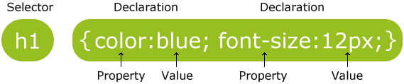
- Styles are defined by rules
- Selector + Declaration block (property + value)
- General structure of style rules
selector1, ..., selectorN {
  property1: value1, ..., valueN;
  property2: value1, ..., valueN;
  ...
  /* this is comment */
}
Selectors
- Tag based
- Class based
- ID based
- DOM tree based
- Attribute based
- …
- We will discuss later in more details
Sample Properties
- Font:
- font-family
- font-size
- font-style
- Text:
- text-align
- color
- letter-spacing
- word-spacing
- Background:
- background-color
- background-image
Sample Properties (Contd.)
- Table
- spacing
- color
- alignment
- List
- style
- style-image
- Box Model
- border-color, border-style, border-width
- width, ...
- background-color, ...
- Position: bottom, left, right, ...
Values
- Values depend on property
- Predefined keywords
- left, right, italic, none, ...
- Color
- red, green, blue, ...
- #XXYYZZ where 00 <= XX,YY,ZZ <=FF
- rgb(XX, YY, ZZ) where 0 <= XX,YY,ZZ <=255
- ...
- Size & Length & Font-size & ...
- Absolute: cm, in, mm, pt, px, …
- Relative: %, em, ex, rem, vw, vh, vmin, vmax, … (we discuss later)
Inline Styles
- Add styles to each tag within HTML file
- Used to format a single HTML element
- Selector is implicitly specified
- Style is given as an attribute
<h1 style="color:red; font-family: sans-serif">Test Heading 1</h1>
- Hard to update
- Violates structure-style separation
- (Only for) styling exceptional element
Internal (embed) Styles
- A style is used in the entire HTML file
- Used to control style of elements (e.g. all h1) in a single web page
<head>
  <style type="text/css">
  h1 {
    color: red;
    font-family: sans-serif;
  }
  </style>
</head>
External Styles
- A text file containing style rules
- Used to control style in multiple web pages
- Example
- A text document with
.cssextension contains
h1, h2, h3, h4, h5, h6 {
  color: #FF0000;
  font-family: sans-serif;
}
External Styles (Contd.)
- External style file is used in HTML web page through linking it to the web page
<head>
  <title>External CSS</title>
  <link href="external_css.css" rel="stylesheet" type="text/css" />
</head>
External Styles Advantages
- Avoid repeating styles for each page
- It is easier to update whole site
- CSS can be cached independent of HTML
- Different style sheets can be attached to the same document
- Personalized & Customization & Media dependent
- A style sheet can import and use styles from other style sheets
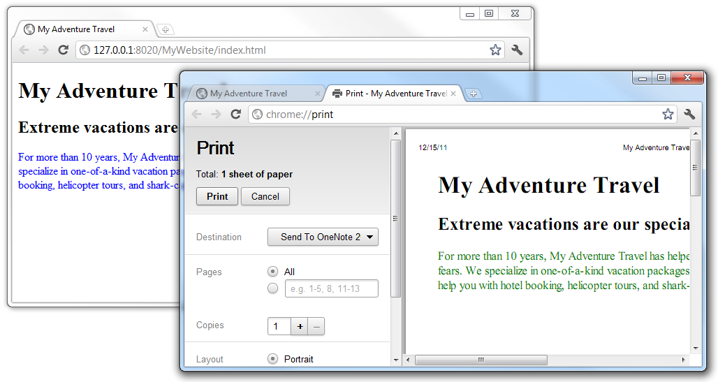
Media Depended Presentation
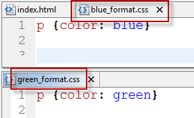
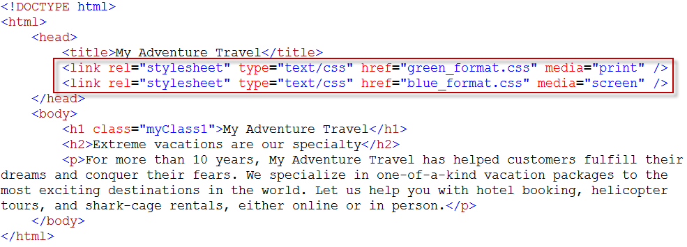
- Web page presentation can be depended on media
- Available media types
<style type="text/css" media="screen">
<link rel="stylesheet" href="style.css" media="all">
- all
- screen
- ...
Media Depended Presentation
Media Depended Presentation
CSS Selectors
- *: universal selector (all elements)
- HTML Tags
- Attribute based
- Special attributes
- Class based: per-class style
- ID based: per-element styles
- In combination with tag names
- In general attribute name, value, ...
- DOM tree based
- Child & Descendant, Sibling, ...
- Pseudo-class & Pseudo-element
- We may not need all these selectors at the beginning; however, they are powerful tools that simplify complex CSS rules
Element Selector
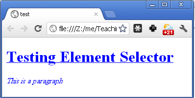
<head>
  <style type="text/css">
    * {color: blue}
    h1 {text-decoration: underline}
    p {font-style: italic}
  </style>
</head>

<body>
  <h1> Testing Element Selector </h1>
  <p> This is a paragraph </p>
</body>
id Selector
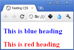
- Assign ID to elements
<h2 id="blue_heading"> This is blue heading </h2>
<h2 id="red_heading"> This is red heading </h2>
#blue_heading {color:blue;}
#red_heading {color:red;}
class Selector
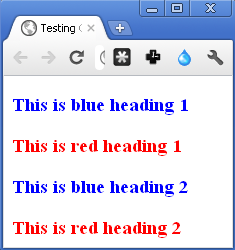
- Assign class to element
<h3 class="blue_heading"> This is blue heading 1</h3>
<h3 class="red_heading"> This is red heading 1</h3>
<h3 class="blue_heading"> This is blue heading 2</h3>
<h3 class="red_heading"> This is red heading 2</h3>
.blue_heading {color:blue;}
.red_heading {color:red;}
Combined Element & Class Selector
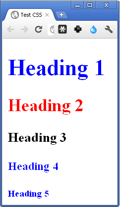
<style type="text/css">
  .all {color: blue;}
  h2.all {color: red;}
  h3.all {color: black;}
</style>

<h1 class="all"> Heading 1 </h1>
<h2 class="all"> Heading 2 </h2>
<h3 class="all"> Heading 3 </h3>
<h4 class="all"> Heading 4 </h4>
<h5 class="all"> Heading 5 </h5>
Multiple Classes
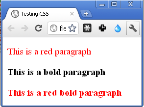
<style type="text/css">
  .red {color:red;}
  .bold {font-weight:bold;}
</style>

<body>
  <p class="red"> This is a red paragraph </p>
  <p class="bold"> This is a bold paragraph </p>
  <p class="red bold"> This is a red-bold paragraph </p>
</body>
<div> and
<span> in CSS
- HTML:
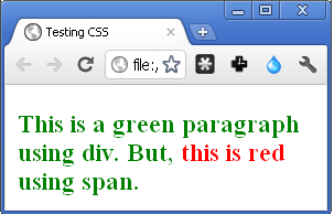
<div class="green_color">
This is a green div. But, <span id="red_color"> this is red </span> using span.
</div>
.green_color {
  color:green;
  font-weight:bold;
}
#red_color {color:red;}
Attribute Selector
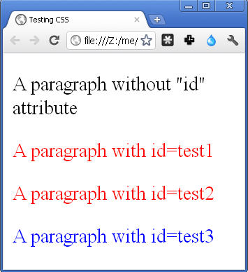
<p> A paragraph without "id" attribute </p>
<p myid="test1"> A paragraph with id=test1 </p>
<p myid="test2"> A paragraph with id=test2 </p>
<p myid="test3"> A paragraph with id=test3 </p>
p[myid] {color:red}
p[myid="test3"] {color:blue}
Pseudo-Classes
- HTML elements have states
- (Almost) all elements: mouse over, clicked, ...
- <a>: Normal (Unvisited), Visited, ...
- Pseudo-classes are used to style the states
- active, first-child, last-child, ...
- E.g.
a:link {color:#FF0000}
a:visited {color:#00FF00}
p:hover {color:#FF00FF}
a:active {color:#FFFFFF}
/* Selects any <p> that is the first element
   among its siblings */
p:first-child {
  color: lime;
}
Pseudo-Elements
- lets you style a specific part of the selected element(s).
- first-letter (in heading & paragraph)
p::first-letter {font-size: 200%;}
p::first-line {color: red;}
/* The ::selection selector matches the portion of
  an element that is selected by a user. */
::selection {font-size: 2em;}
- before & after
- Mainly used with
{ content: url(something); }to insert an object before & after and element
.google::after{
  content: url("google_logo.gif");
}
Pseudo-Classes/Elements (Contd.)
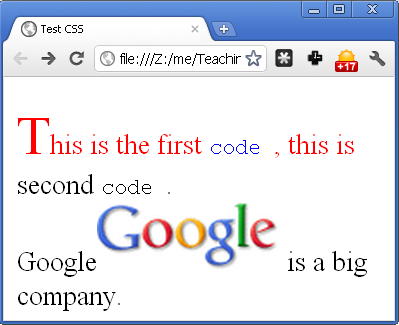
<style type="text/css">
  p code:first-child {color: blue;}
  p::first-letter {font-size: 200%;}
  p::first-line {color: red;}
  .google::after{content:url("google_logo.gif");}
</style>

<p>
  This is the first <code> code </code>,
  this is second <code> code </code>. <br />
  <span class="google">Google</span>
  is a big company.
</p>
::selection {
  color: #fff;
  background: #FF5E99;
  text-shadow: none;
}
DOM based: Child Selector
- When we want to select elements which are inside other elements
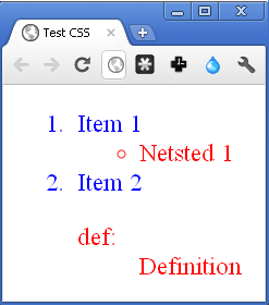
- To select a (direct) child of parent parent > child {property: value;}
<style type="text/css">
  ol {color: red;}
  ol > li {color: blue;}
</style>

<ol>
  <li> Item 1 </li>
  <ul> <li> Nested 1</li> </ul>
  <li> Item 2 </li>
  <dl> <dt> def: </dt> <dd> Definition </dd>
  </dl>
</ol>
DOM based: Descendant Selector
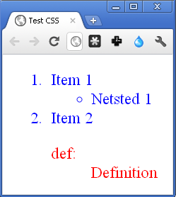
- To select descendant of a tag tag descendant {property: value;}
<style type="text/css">
  ol {color: red;}
  ol li {color: blue;}
</style>

<ol>
  <li> Item 1 </li>
  <ul> <li> Nested 1</li> </ul>
  <li> Item 2 </li>
  <dl> <dt> def: </dt> <dd> Definition </dd>
  </dl>
</ol>
DOM based: Sibling Selector
- When we want to select elements which are next to other elements
- To select tag2 which is immediate successive sibling of tag1
tag1 + tag2 {property: value;}
tag1 ~ tag2 {property: value;}
DOM based: Sibling Selector
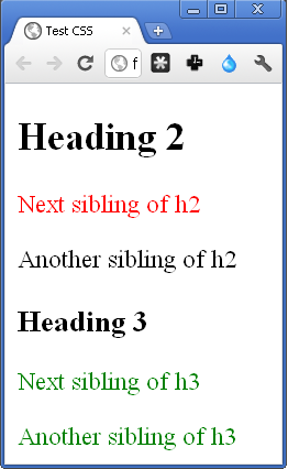
h2+p {color:red;}
h3~p {color:green;}
<h2> Heading 2 </h2>
<p> Next sibling of h2 </p>
<p> Another sibling of h2 </p>

<h3> Heading 3 </h3>
<p> Next sibling of h3 </p>
<p> Another sibling of h3 </p>
CSS Selectors Summary
- *: universal selector (all elements)
- HTML Tags: h1, …, h6, p, li, table, tr, …
- Class: .
- ID: #
- General attribute: []
- Child: >
- Descendant: (space)
- Sibling: + ~
- Pseudo-class: :active, :hover, :first-child, …
- Pseudo-element: ::before, ::after, ::first-line, ::first-letter, …
Cascading
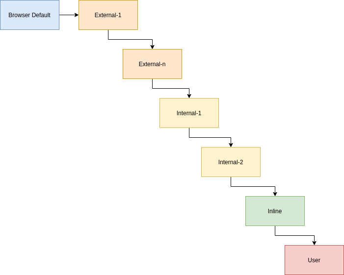
Assuming there is not any conflicting style and external styles are linked before internal styles in the head
Cascading (Contd.)
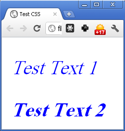
test.css
p {
  font-style: italic;
}
index.html
<head>
  <link href="test.css"
   rel="stylesheet"
   type="text/css" />
  <style type="text/css">
    p {color: blue;}
  </style>
</head>
<body>
  <p> Test Text 1</p>
  <p style="font-weight: bold;"> Test Text 2 </p>
</body>
Inheritance
- HTML document is interpreted as a tree
- DOM tree
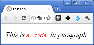
- Children inherit some styles from their parent
- Not all properties, e.g. border
p {font-style: italic;}
code {color: red;}
Conflicting Styles & Overriding
- What happen if multiple style rules specify different values for the same property of an element?
- External style:
p {color: red} - Internal style:
p {color: blue} - They are conflicting
- What is the final rule?
- It depends on
- Rule types, order, …
- Specified by the overriding algorithm
Overriding
- In general,
- Priority 1: more specific (increase by specificity)
- Type selectors (e.g.,
h1) - pseudo-elements (e.g.,
::before).
- Type selectors (e.g.,
- Class selectors (e.g.,
.example) - attributes selectors (e.g.,
[type="radio"]) - pseudo-classes (e.g.,
:hover)
- Class selectors (e.g.,
- ID selectors (e.g.,
#example). - Inline
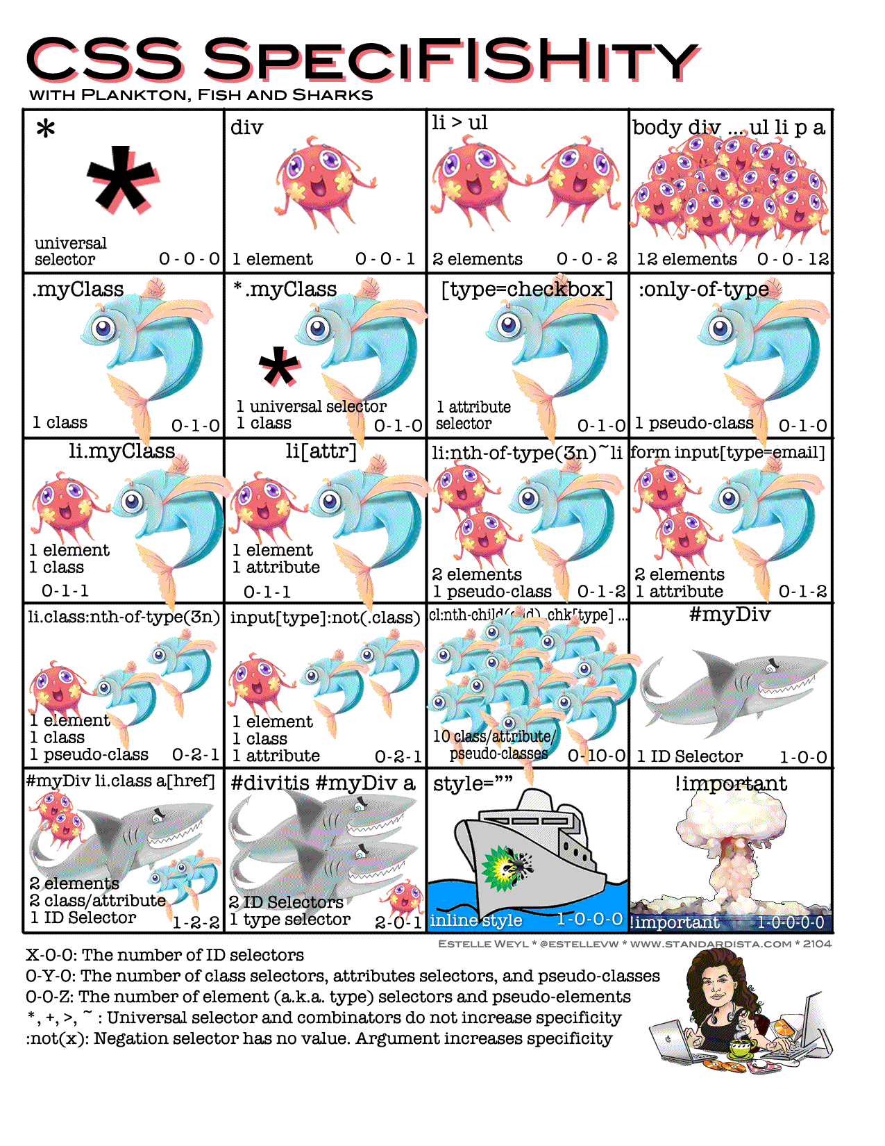
Overriding
- Priority 2: more closer to the element if they are specific as the same as each other (e.g., both are id selector)
- Inline > Internal
- Inline > External
- Internal <?> External
- The style that comes after the other
- styles override more general styles
- Children’s style overrides parent’s style
Overriding (Contd.)
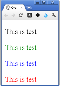
<style type="text/css">
  p {
    color: red;
  }
  p.c {
    color: blue;
  }
  p#i {
    color: green;
  }
</style>

<p class="c" id="i" style="color: black">This is test</p>
<p class="c" id="i">This is test</p>
<p class="c">This is test</p>
<p>This is test</p>
Overriding (Contd.)
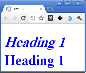
- To prevent overriding, add
!important - Be careful: inherited properties are overridden even if they are important
<style>
h1{font-style: italic;
color: blue !important}
</style>

<h1> Heading 1 </h1>
<h1 style="font-style: normal;color: red">Heading 1</h1>
CSS Box Model
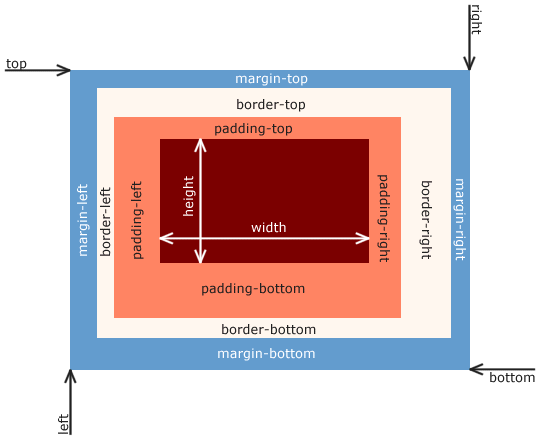
- Each HTML element is a box
- Content
- Padding
- Border
- Margin
CSS Box Model Properties
- Borders
- Color, Width, Style, ...
- Individual or altogether
- Spaces (Padding & Margins)
- Individual or altogether
- Content
- Dimensions
- Background
- Color
- Image
CSS Box Model (Contd.)
- Border
border-left,border-right,border-bottom,border-topborder: All borders- Padding
padding-left,padding-right,padding-top,padding-bottompadding: All padding
- Margin
margin-left,margin-right,margin-top,margin-bottommargin: All margins- Centering block elements:
margin-left: auto; margin-right: auto; - Content (dimensions)
width,height,max-width, …
CSS Box Model (Contd.)
.demo.one {
  border-style:solid;
  border-width:3px;
  border-color:black;
  margin-left:0.5cm;
  padding-left:3cm;
  margin-right:3cm;
  padding-right:0.5cm;
}
This is the <span class="demo one">first box</span>, and this is the
<span class="demo one">second box</span>
Vertical Margin Collapse
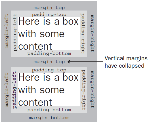
- When a bottom margin of one element meets the top margin of another, only the larger of the two will show
- This only applies to vertical margins; the same is not true for left and right margins
This is a normal paragraph.
This is the red paragraph.
Content: Background
body{
  background-image: url("linux.jpg");
}
p {
  background-color: white;
  font-size: 3em;
}
p#red{
  width: 50%;
  border-style: solid;
  border-width: 8px;
  border-color: white;
  background-color: #CF0000;
}
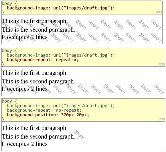
Content: Background Image
- Background image repetition
background-repeatrepeat (default)no-repeatrepeat-xrepeat-y- Avoid background image scrolling
background-attachment: fixed- Background image position
background-position: center center | center top | center bottom |
left top | xpos ypos ...
Content: Background Image (Contd.)
Block vs. Inline
- Block-level elements:
- The default height is the height of the content
- The default width is the width of its containing block
- We can set height & width in CSS
- Can have inline or block elements as children
- Flow top to bottom
- All block-level elements appear on their own line
Block vs. Inline (Contd.)
- Inline elements:
- The height is the height of the content
- The width is the width of the content
- We cannot set the height & width in CSS
- Can have inline or block elements as children
- You can't put block elements inside inline elements.
- Flow left to right
- Inline elements appear on the same line unless the line wraps or there’s an explicit line break
Block vs. Inline (Contd.)
This is the
.demo.three {
  border-style: solid;
  border-width: 3px;
  border-color: black;
  width: 10cm;
  height: 5cm;
  background-color: red;
}
.demo.four {
  border-style: solid;
  border-width: 3px;
  border-color: black;
  width: 10cm;
  height: 5cm;
}
Layout Design = Element Positioning
- Two positioning schemes
- Normal
- Block-level elements flow from top to bottom
- Inline elements flow from left to right
- Specific position
- Element is taken out from normal flow
- It is placed in the specified position
Specified Positioning
- Positioning of block-level element can be
specified using the
positionproperty
| Property | Value | Description |
|---|---|---|
| position | static | default position = Normal |
| relative | offset from its normal static position | |
| absolute | a fixed position within its containing element | |
| fixed | a fixed position within the browser window | |
| sticky | this is basically a hybrid between relative and fixed position. | |
| top, bottom, left, right | positions of box's corners | |
Static Positioning
- The default position of HTML elements is static.
- Static elements are positioned according to the normal flow of the page.
- They are not affected by top, left, bottom, and right values.
Relative Positioning
- A relative positioned element is positioned relative to its normal position
- The reserved space (box model: content + padding + margin) for the element is still preserved in normal flow
- Position is specified by top, left, right, bottom properties, e.g.,
top: +20px- move the element 20px downward
top: -20px- move the element 20px upward
bottom: -20px- move the element 20px downward
bottom: +20px- move the element 20px upward
The paragraph 1
The paragraph 2
The paragraph 3
The paragraph 4
p.demo.five {
  border-style: solid;
  border-width: 2px;
  border-color: black;
  width: 300px;
}

#m {
  position: relative;
  left: 50%;
  top: 150px;
  border-color: red;
}
Absolute Positioning
- An absolute position element is positioned relative to the first parent element that has a position other than static
- If no such element is found, the containing block is
<html> - Absolute positioned elements are removed from the normal flow
- The document and other elements behave like the positioned element does not exist (no space for content, padding, margin)
- The positioned elements can overlap other elements
- Position is specified by
top,left,right,bottomproperties
<a href="https://1995parham-teaching.github.io/ie-lecture/" target="_blank">
  <img style="position: absolute; top: 0; right: 0; border: 0;" src="/img/forkme_right_orange.png" alt="Fork me on GitHub">
</a>
The paragraph 1
The paragraph 2
The paragraph 3
The paragraph 4
Fixed Positioning
- An element with fixed position is positioned relative to the browser window
- Its position does not change by scrolling the page
- Very useful for menus
- These elements are removed from the normal flow
- The document and other elements behave like the fixed positioned element does not exist (no content, padding, margin)
- Fixed positioned elements can overlap other elements
- Position is specified by
top,left,right,bottomproperties
Sticky Positioning
- This one is somehow a combination of relative and fixed positions.
- A sticky element acts like it's relatively positioned until it's scrolled to a certain threshold. After that, its position becomes fixed (e.g. after scrolling for 20px, it will be fixed on the page).
- You must at least specify one of top, left, bottom or right for sticky to work.
.sticky-element {
  position: sticky;
  top: 0px;
  background-color: orange;
}
Scrolling index
- A
- Apple
- Ant
- Altimeter
- Airplane
- B
- Bird
- Buzzard
- Bee
- Banana
- Beanstalk
- C
- Calculator
- Cane
- Camera
- Camel
- D
- Duck
- Dime
- Dipstick
- Drone
- E
- Egg
- Elephant
- Egret
Let's write some code
- Fixed Top Menu
- Github Ribbon
- Introduction Background
Controlling Overlap Order
- Elements can overlap other elements
- When positioned out of the normal flow
- The
z-indexspecifies the stack order of an element - Positive or negative stack order
- Larger value foreground
This is a Linux

img {
  position: absolute;
  left: 0px;
  top: 0px;
  z-index: -1;
}
h1 {
  color: red;
}
Float Design
- Floating effects
- Element is pushed left or right as far as possible in the row that it would be positioned in when the normal flow is used
- Float outer edge touches containing block edge or outer edge of another float elements
- Space is reserved for the element
- Content (text) of other elements wraps around it
- Float elements do not fill a row individually even if are block-level
- No break before/after block-level elements
- Other elements (typically) don’t overlap with floats
- Configured using
float: left | right | none
Vertical Margin Collapse in Float
- Vertical margins are not collapsed for floats
- In the following float: right box fills the gap and also respects to top box margin
Top
float: right; width: 45%;
width: 45%;
Clearing around Float Elements
- Remark: Contents of other elements wrap around previously positioned float object
- To stop wrapping content of an element around a float object, the
normalelement must set theclearproperty - The
clearproperty can be set toleft,right, orboth - Setting the clear property of an element to left (right)
- My content does not wrap around any float object that is in left (right) side of me
- In other words, the content of the element is rendered if the float object wouldn't be float
- Applicable only for block-level elements
Sample Application of Float & Clear
Two Columns with Float
This is header
Left Column
This is a paragraph in the left column
Right Column
Menu Item 1
Menu Item 2
Two Columns with Float
This is header
Left Column
This is a paragraph in the left column
Right Column
Menu Item 1
Menu Item 2
Two Columns with Float
This is header
Left Column
This is a paragraph in the left column
Right Column
Menu Item 1
Menu Item 2
Display Property
- Displaying elements are mainly influenced by the
displayproperty inline: no break after or before, no width/heightblock: break after and before, fill a line, width/height are modifiableinline-block: inside is formatted as block-level box, the element formatted as an inline-level box- Are like inline but can have a width and a height
flexgrid
inline-block Display Example
.demo.inline {
  display: inline;
}
.demo.inlineblock {
  display: inline-block;
  width: 180px;
  height: 100px;
  border-style: solid;
  border-width: 3px;
}
<div class="demo inline">1</div>
<div class="demo inline">
  <span>2</span>
  <div class="demo inlineblock">3 4 5 6 7 8 9 0</div>
  <div class="demo inlineblock">3 4 5 6 7 8 9 0</div>
  <div class="demo inlineblock">3 4 5 6 7 8 9 0</div>
</div>
flexbox overview
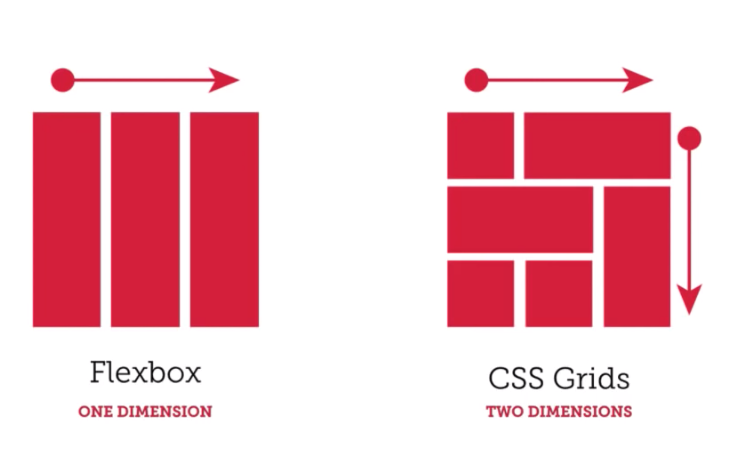
- One-dimensional layout model
- Composed of flex container and flex items
- Properties of flex container: direction and wrapping
- The main axis (flex-direction)
- row, row-reverse, column, column-reverse
- Properties of flex items: grow, shrink, justify, …
FlexBox Container And Items
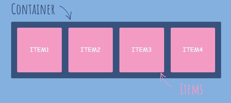
We can create a flex container using display: flex
Now we have flex container and flex items
So what is the point of creating a flex container and its items?
FlexBox Axises
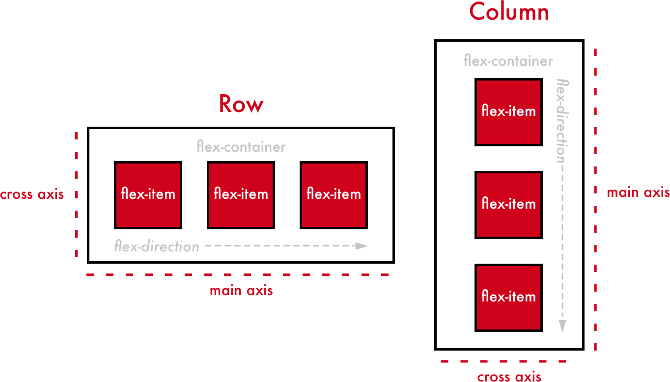
      .flex-container {
        flex-direction: row | column | row-reverse | column-reverse;
        /* Default flex-direction: row */
      }
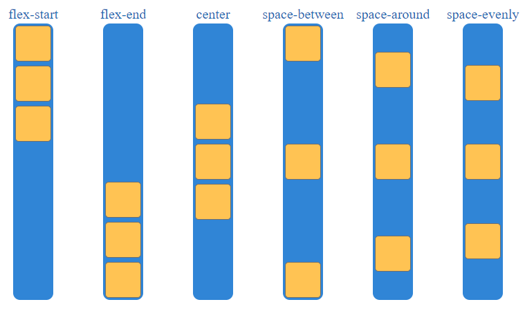
We can align flex items in the direction of main axis using justify-content property
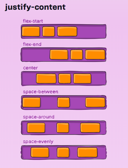
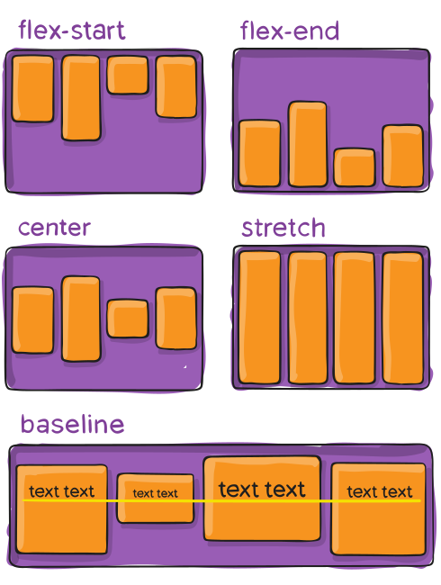
We can align flex items in the direction of cross axis using align-items property
FlexBox Examples
            .container {
              display: flex;
              flex-direction: row;
              justify-content: space-between;
            }
            .container {
              display: flex;
              flex-direction: row-reverse;
              justify-content: space-around;
            }
            .container {
              display: flex;
              flex-direction: column;
              align-items: center;
            }
Flex Wrap
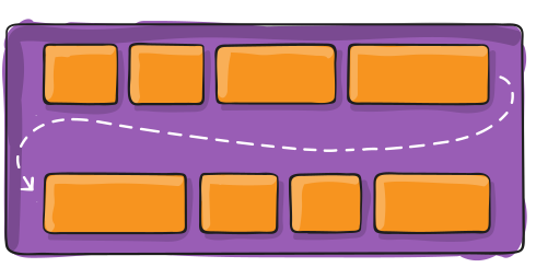
Controls the wrapping of the container
Items will be wrapped if there is not enough space
        .flex-container {
          flex-wrap: nowrap | wrap | wrap-reverse;
          /* nowrap is the default — note there is no hyphen */
        }
            .container {
              display: flex;
              flex-direction: row;
              justify-content: space-between;
              flex-wrap: wrap;
            }
Gap property
You can set a gap between rows and columns
row-gap: set gap between rows
column-gap: set gap between columns
gap: a shorthand for row-gap column-gap
        .flex-container{
          gap: 10px 20px;
          /* row-gap: 10px; */
          /* column-gap: 20px; */
        }
        .container {
          gap: 20px;
        }
Why don't we just use margin?
Gap is a useful property in responsive design
We will see the difference in the media query section
Flex item properties
- flex-grow: specifies how much the item will grow relative to the rest of them
- Flex shrink specifies how much the item will shrink relative to the rest of them
- flex-basis specifies the initial length of a flex item
- order specifies the order inside the flex container
In a flex container, try to use flex-basis instead of width property. Because flex-basis specifies width or height depending on the value of flex-direction.
            .container {
              display: flex;
              flex-direction: row;
              justify-content: space-between;
            }

            .blue {
              flex-basis: 300px;
            }
          .container {
            display: flex;
            flex-direction: column;
            align-items: center;
          }

          .blue {
            flex-basis: 300px;
          }
            .container {
              display: flex;
              flex-direction: row;
              justify-content: space-between;
            }

            .blue {
              flex-grow: 1;
            }
            .container {
              display: flex;
              flex-direction: row;
              justify-content: space-between;
            }

            .blue {
              flex-grow: 1;
            }

            .tomato {
              flex-grow: 2;
            }
            .container {
              display: flex;
              flex-direction: row;
              justify-content: space-between;
            }

            .blue {
              order: 4;
            }
Flex shorthand property
Instead of using
      .item{
        flex-grow: 1;
        flex-shrink: 1;
        flex-basis: 300px;
      }
You can use flex property
      .item{
        flex: 1 1 300px; /* flex-grow flex-shrink flex-basis */
      }
Flex item - align self
Use align-self to override align-items for an individual item
        .item {
          align-self: auto | flex-start | flex-end | center | stretch
        }
          .container {
            align-items: center;
          }

          .blue {
            align-self: flex-end;
          }

          .tomato {
            align-self: flex-start;
          }

          .orange {
            align-self: stretch;
          }
Grid
- Two-dimensional layout model
- Divides a page into major regions, defines the relationship in terms of size, position, and layer, between parts
- Grid vs. Tables
- Like tables, enables to align elements into columns and rows
- However, many more layouts are possible
- E.g., child elements could position themselves so they actually overlap
Defining a Grid
The container declares the tracks, and the children fall into them in order.
        .container {
          display: grid;
          grid-template-columns: 200px 1fr 1fr;
          gap: 16px;
        }
- fr is a fraction of the leftover space, so the columns above are fixed, half, half
- gap replaces the margin tricks that floats needed
Repeating Tracks
        .container {
          display: grid;
          grid-template-columns: repeat(3, 1fr);
        }
A responsive gallery, with no media query at all:
        .gallery {
          display: grid;
          grid-template-columns: repeat(auto-fit, minmax(200px, 1fr));
          gap: 16px;
        }
- Fit as many 200px columns as possible, then share what is left
Placing Items
An item can span tracks, by line number or by name.
        .hero {
          grid-column: 1 / 3; /* from line 1 to line 3, so two columns */
          grid-row: 1;
        }
Or describe the layout as a picture:
        .page {
          display: grid;
          grid-template-areas:
            "header header"
            "side   main"
            "footer footer";
        }

        .page > nav { grid-area: side; }
FlexBox VS Grid
Custom Properties
- CSS has variables, and unlike a preprocessor's they live in the browser
- They cascade and inherit, like any other property
        :root {
          --brand: #ff9100;
          --gap: 16px;
        }

        .button {
          background: var(--brand);
          padding: var(--gap);
        }
Why It Matters
- A variable can be redefined for a subtree, so one declaration re-themes everything below it
- It can be read and written from JavaScript, which a preprocessor variable never can
        .dark {
          --brand: #ffcc00;
        }
element.style.setProperty("--brand", "#00e5ff");
Sizing Without Breakpoints
clamp(min, preferred, max)picks the preferred value, but never leaves the bounds
        h1 {
          font-size: clamp(1.5rem, 4vw, 3rem);
        }
- The heading grows with the viewport, stays readable on a phone, and stops growing on a projector
min()andmax()work the same way
Element Sizing
- Absolute values (Useful?!)
cm- centimeters
mm- millimeters
in- inches (1in = 96px = 2.54cm)
px- pixels (1px = 1/96th of 1in)
pt- points (1pt = 1/72th of 1in)
- Relative values
- em
- Relative to the font-size of the element
- rem
- Relative to font-size of the root element
- vw / vh
- Relative to 1% of the width / height of the viewport
- vmin / vmax
- Relative to 1% of viewport's smaller / larger dimension
- %
- Relative to the parent element
- fr
- Fr is a fractional unit and 1fr is for 1 part of the available space. (CSS Grid Layout)
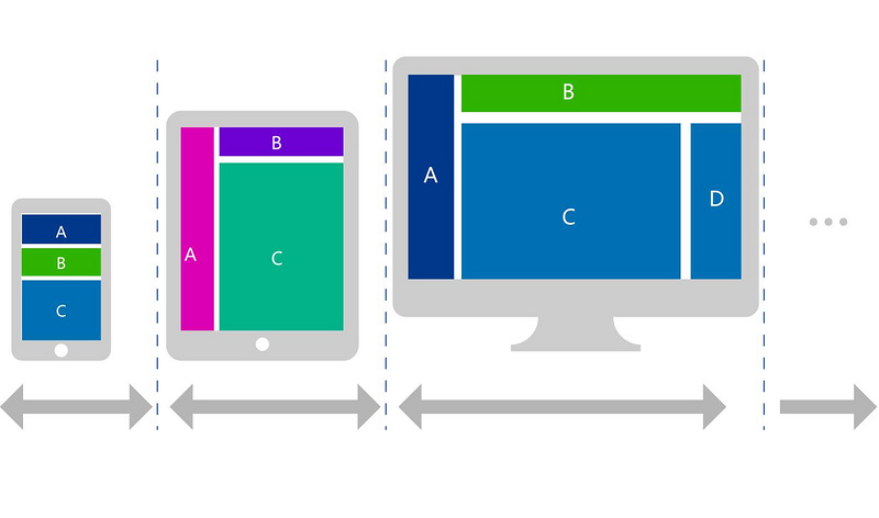
Responsive Design
Responsive Design is the practice of making sure your content looks good on all screen sizes.
Everything in the website including layouts, fonts and images should automatically adapt to the user's device.
Media Query
Apply a block of CSS properties only if a certain condition is true
      @media mediatype and (media-feature) {
         /* Styles */
      }
Media Types
Defines the category of device
- all: All devices
- print: Print preview mode
- Screen: Devices with screens
- Speech: Screen readers
Media Feature
Describe a specific characteristic of the browser
- width
- height
- orientation
Logical Operators
Create more complex media queries using logical operators
- and
- not
- , (comma)
        @media screen and (media-feature) and (media-feature) {...}

        @media screen and (media-feature), print and (media-feature) {...}

        @media not screen and (media-feature)
Media Query Examples
Try to resize the screen
        @media screen and (max-width: 800px){

          .box{
            width: 250px;
            height: 250px;
            background-color: #2c3e50;
            border-radius: 10px;
            border-color:#c0392b ;
          }
        }
        .box {
          flex-basis: 33%;
        }

        @media screen and (max-width: 600px){

          .flex-container {
            flex-wrap: wrap;
          }

          .flex-item {
            flex-basis: 100%
          }
        }
You can have multiple media queries
        @media screen and (max-width: 800px){

          .box {
            background-color: #2c3e50;
          }
        }

        @media screen and (max-width: 600px){

          .box {
            background-color: #16a085;
          }
        }
        .main {
          gap: 2%;
        }

        .box {
          flex-basis: 32%;
        }

        @media screen and (max-width: 600px){

          .sidebar {
            display: none;
          }

          .main {
            flex-wrap: wrap; /* or set it out of media query */
          }

          .box {
            flex-basis: 100%;
          }

        }
Try to change the orientation
        @media screen and (orientation: landscape){

          .box{
            width: 250px;
            height: 250px;
            background-color: #2c3e50;
            border-radius: 10px;
            border-color:#c0392b ;
          }
        }
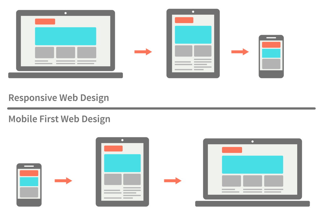
Responsive Design approaches
CSS Functions
- CSS functions are used as a value for various CSS properties, e.g.,
- Color:
rgb(),hsl(),oklch(), … - Content:
url(),image(), … - Variables & Calculation:
var(),calc(), … - Transformation:
scale(),translate(),rotate(), … - Repeat:
repeat()
CSS Variables
:root {
  --blue: #1e90ff;
  --white: #ffffff;
}

body { background-color: var(--blue); }

h2 { border-bottom: 2px solid var(--blue); }

.container {
  color: var(--blue);
  background-color: var(--white);
  padding: 15px;
}

button {
  background-color: var(--white);
  color: var(--blue);
  border: 1px solid var(--blue);
  padding: 5px;
}
CSS Animations
/* The animation code */
@keyframes example {
  0%   {background-color:red; left:0px; top:0px;}
  25%  {background-color:yellow; left:200px; top:0px;}
  50%  {background-color:blue; left:200px; top:200px;}
  75%  {background-color:green; left:0px; top:200px;}
  100% {background-color:red; left:0px; top:0px;}
}

/* The element to apply the animation to */
#the-animation {
  width: 100px;
  height: 100px;
  position: relative;
  background-color: red;
  animation-name: example;
  animation-duration: 4s;
}
Hidden Elements
visibility:hiddenhides the element but it still keeps its space, whereasdisplay:noneIt is hidden and takes no space
CSS Tools
- Validation
- W3C validator
- Firefox add-ons
- Chrome “inspect element”
- On the fly CSS modification
- Firefox Web Developer CSS Editor
- Chrome “inspect element”
What is Next?!
- CSS is not versioned any more — each module has its own level, and browsers ship them one at a time
- Worth knowing, all supported across browsers today:
:has()— style a parent from its children, the long-awaited "parent selector"@container— respond to the size of the container rather than the viewport, which is what components actually need&nesting — write nested rules without a preprocessor@layer— decide which stylesheet wins without escalating specificitysubgrid— let a child line up on its parent's grid tracks